Qantas Airways (QF), whose name comes from the origins of its formation on 16 November 1920 as the Queensland and Northern Territory Aerial Services, unveiled its Coral Reef livery on its Airbus A321XLR. Over the course of more than a century, the airline has refreshed its signature red-and-white identity just five times since the flying kangaroo first appeared on an aircraft tail in 1944.
The Birth of The Flying Kangaroo: The 1944 And 1947 Liveries
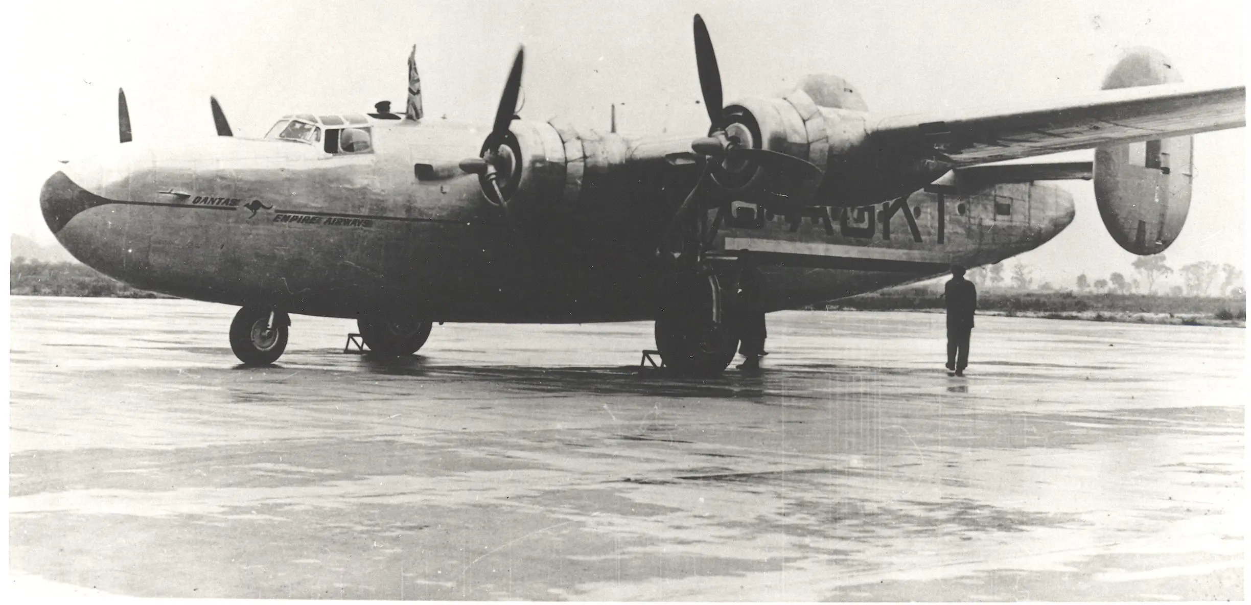
The kangaroo did not begin as the elegant, stylized silhouette it is today. The original symbol was adapted from the Australian one-penny coin and was first painted beneath the cockpit of Qantas’ Consolidated B-24 Liberator aircraft, G-AGKT, in 1944, following the airline’s decision to name its Indian Ocean passage the Kangaroo Service. The choice of the penny coin as inspiration grounded the emblem in everyday Australian identity, a deliberate act of national ownership that would prove enduring.
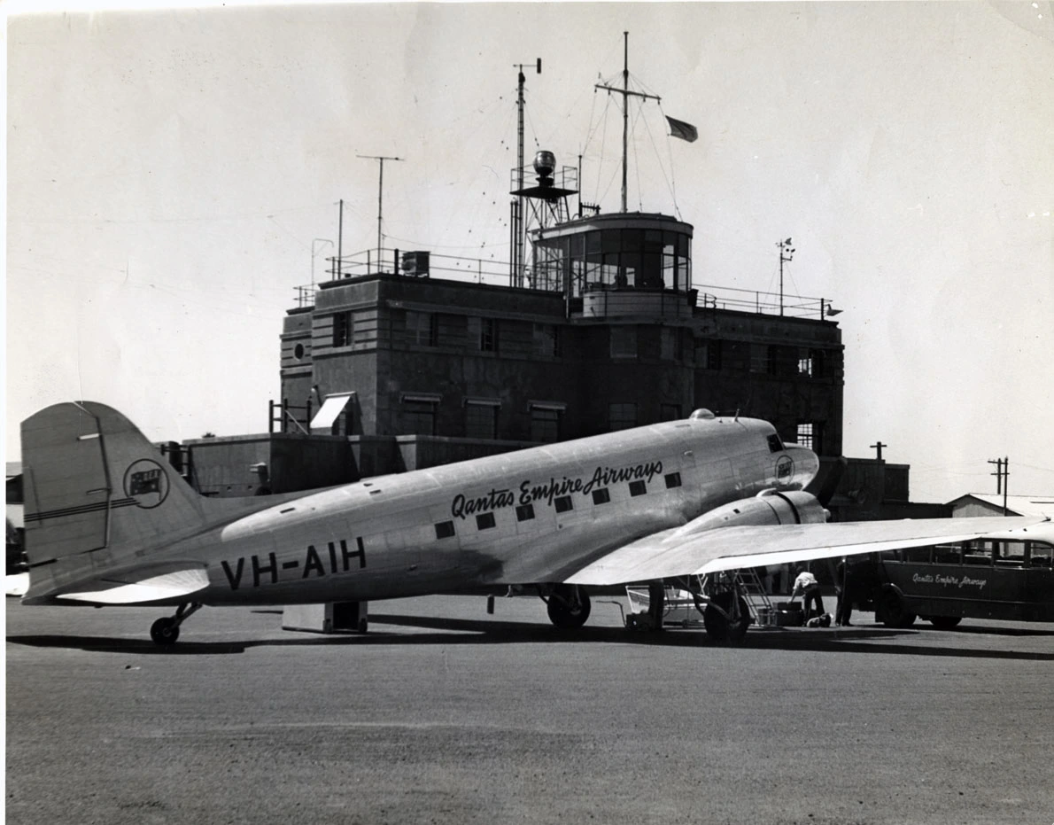
That first kangaroo was naturalistic, left-facing, and unadorned by wings. The emblem featured on all Qantas aircraft from that point forward, with the Liberators being the first to carry it as a permanent livery element.
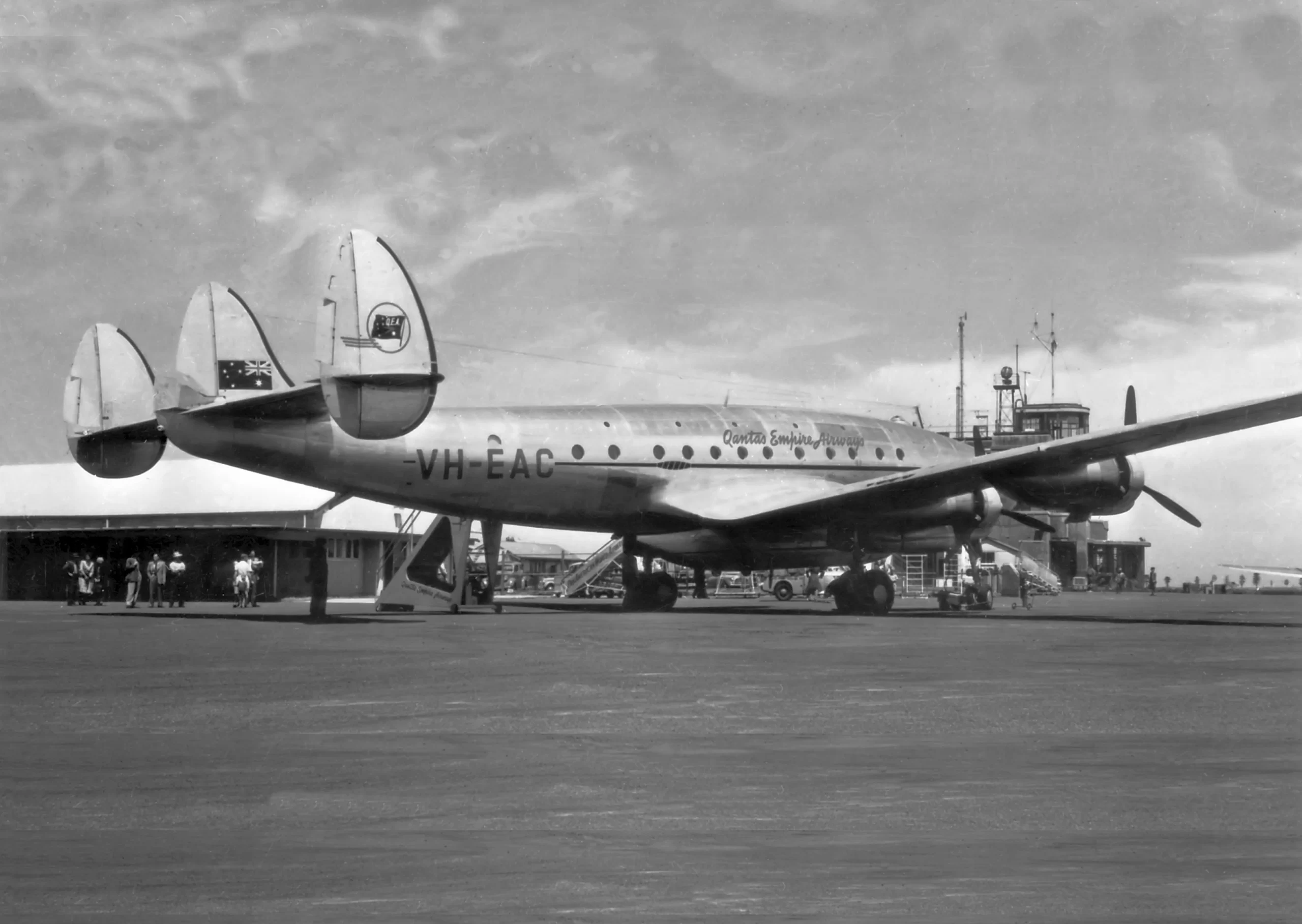
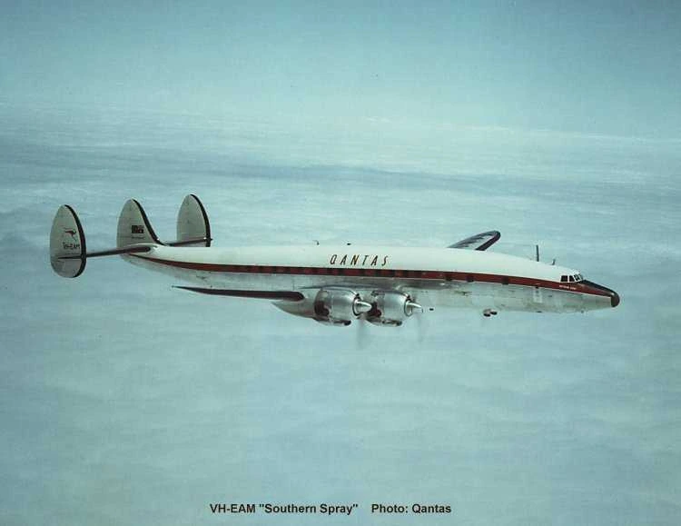
The first substantive redesign arrived in 1947, when Qantas took delivery of its Lockheed L-749 Constellations and the Australian Commonwealth government nationalised the carrier, designating it Australia’s flag carrier. The 1947 redesign introduced a winged kangaroo — rendered in blue and white against a globe — created by artist Gert Sellheim.
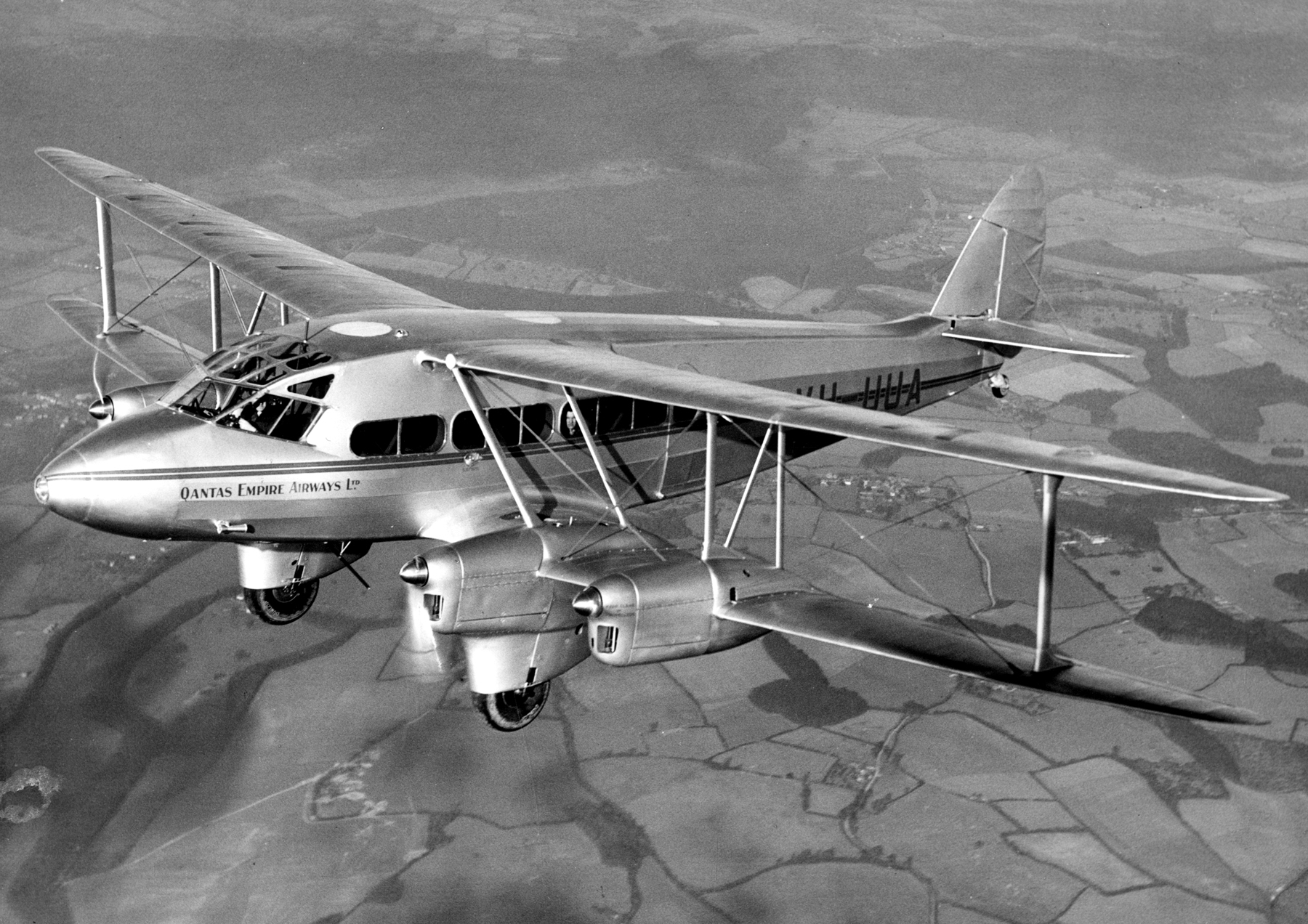
The Red Stripe Livery (1959) And V-Jet Livery (1961) During the Jet Age
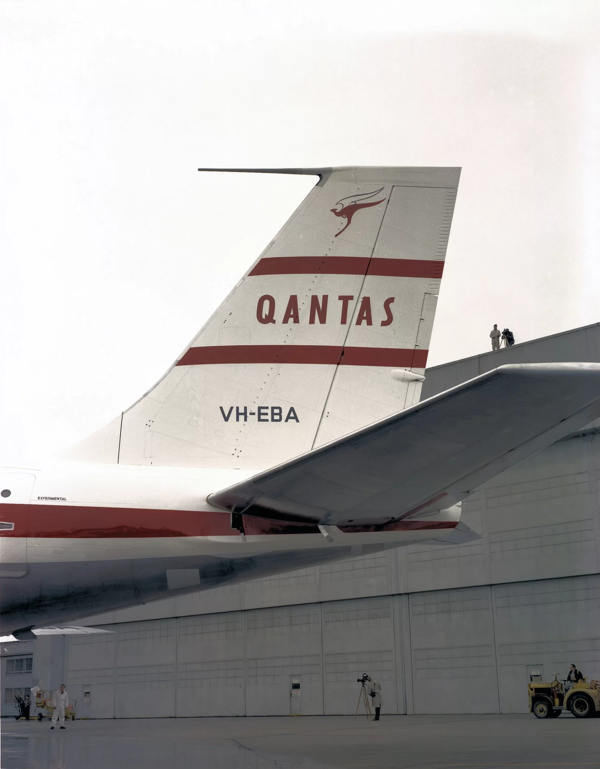
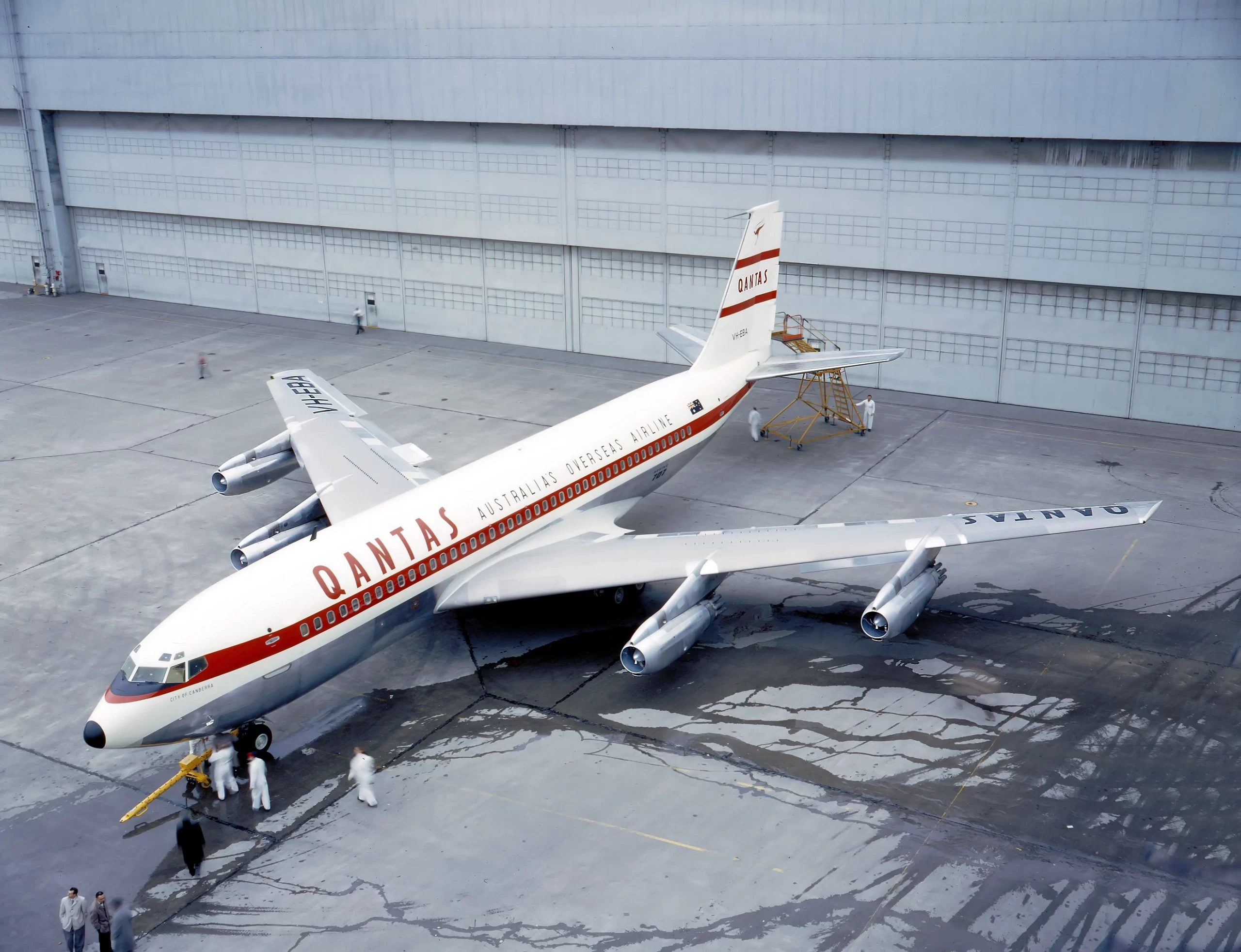
The arrival of the Boeing 707 in 1959 marked the most transformative moment in Qantas’ operational history up to that point, and it demanded a new visual identity to match. According to Norebbo, Qantas introduced the Red Stripe livery with the Boeing 707-138B — a predominantly white fuselage bisected by a solid red stripe running its entire length, with two thinner red pinstripes on the vertical stabiliser.
The Qantas wordmark was sandwiched between those stabiliser stripes, and the overall effect was one of clean, jet-age modernity.
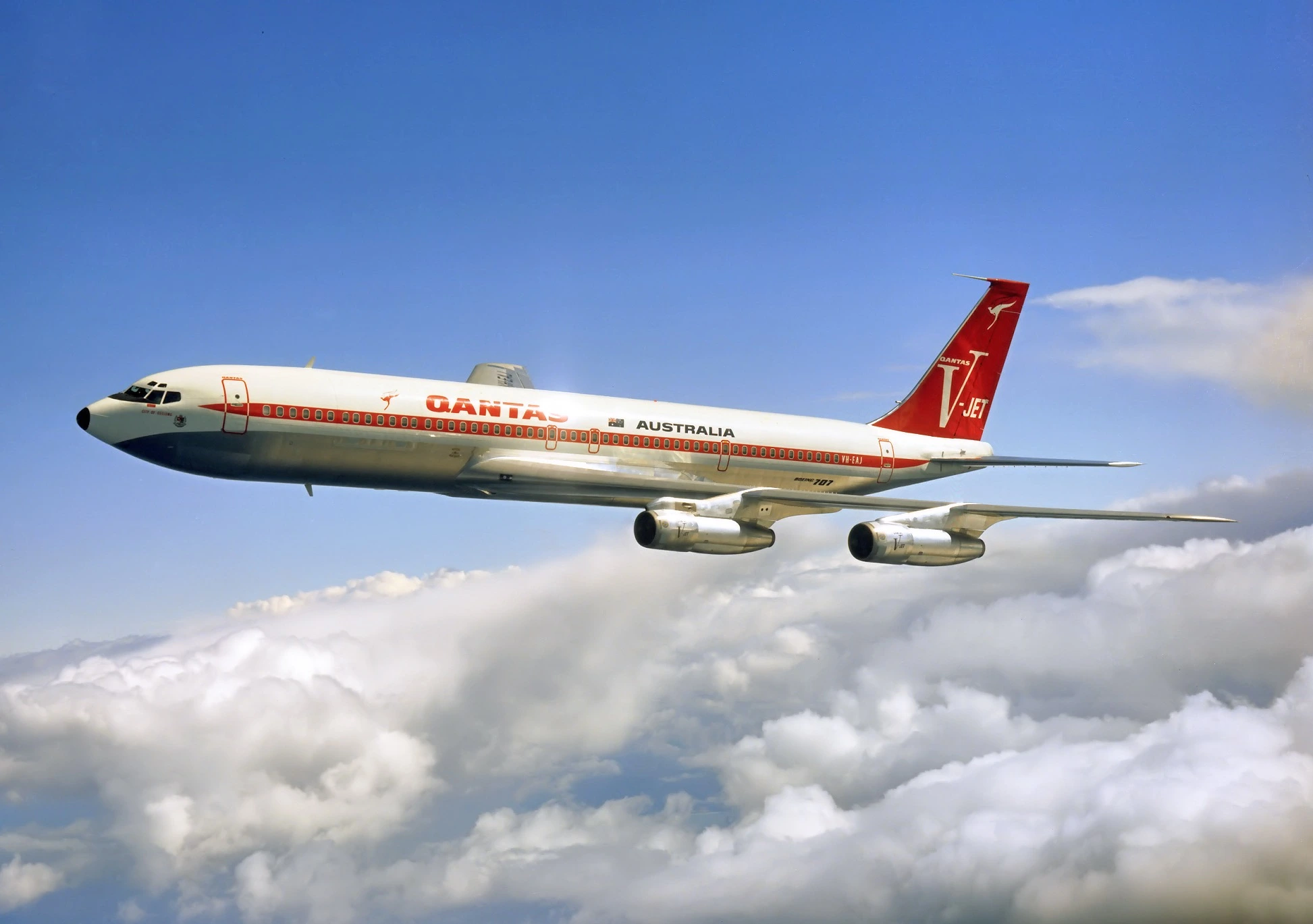
The Red Stripe livery lasted only two years before yielding to what is widely regarded as the most visually arresting Qantas identity of the jet era. In 1961, the airline unveiled the V-Jet livery to celebrate the Boeing 707’s fan-jet engines. The vertical stabiliser was painted solid, vivid red, and a single bold stripe replaced the previous pinstripes, running the length of the fuselage. A stylised V-Jet logo dominated the tail, and bolder Qantas titling replaced the thinner typeface of its predecessor.
The Flying Kangaroo Livery (1971–1984)
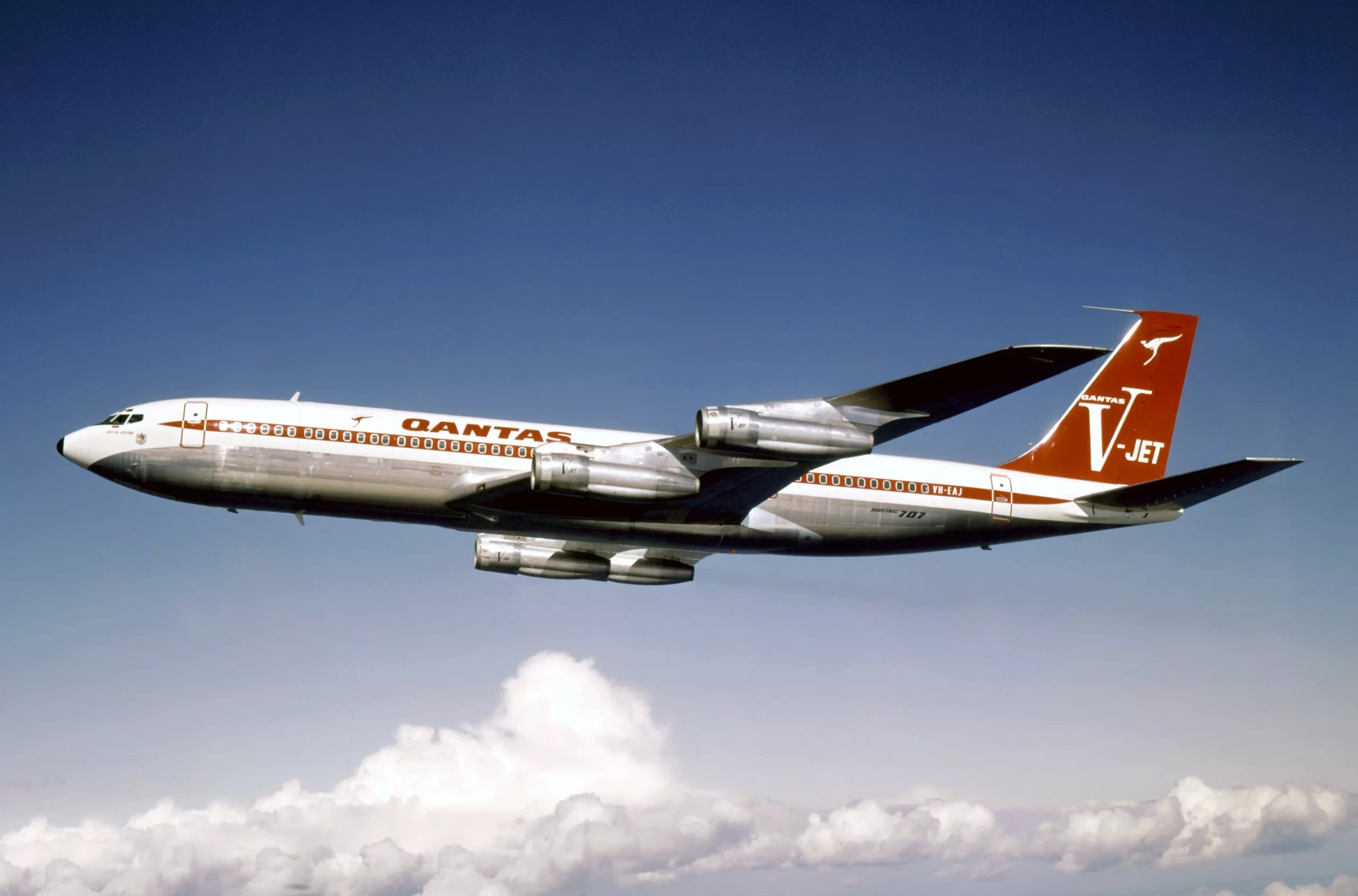
The V-Jet era ended after Qantas took delivery of its first Boeing 747 in 1971, as the carrier prompted another wholesale redesign — this time featuring a large flying kangaroo set against a red tail, paired with an all-white fuselage that eliminated the red cheat line of its predecessors. An ochre cheat line ran along the fuselage, adding warmth and a distinctly Australian palette to the composition.
The 1984 Redesign Made Qantas’ Livery Modern
The next evolutionary step came in 1984, coinciding with the arrival of the Boeing 747-300 and shortly after with the Boeing 767-300 in 1985. The 1984 redesign removed the kangaroo’s wings for the first time since 1947 and refined the animal into a more slender, stylised presentation.
The kangaroo’s body and legs were also extended further down the fuselage from the tail, giving the logo a sense of forward momentum and dynamism that previous iterations had not emphasized.
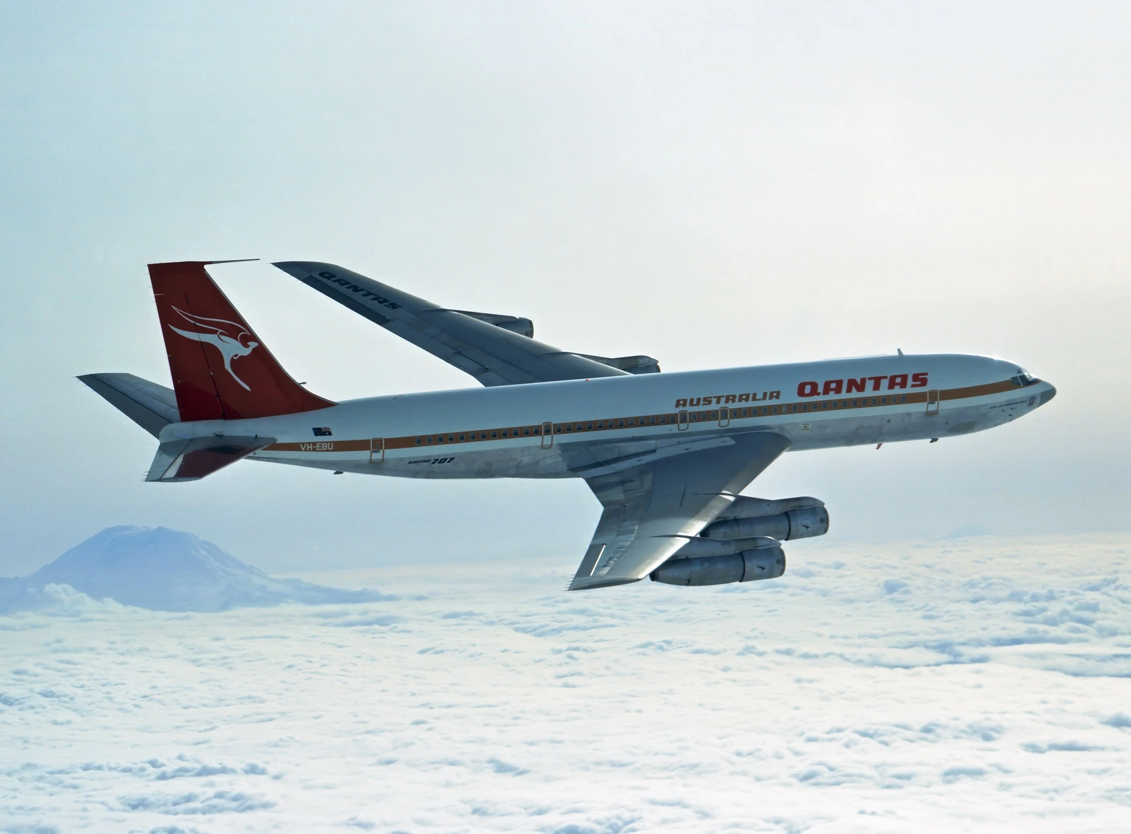
The 1984 livery retained the red tail and white fuselage but brought a sharper, more contemporary graphic sensibility. The fuselage titling was updated alongside the logo.
Qantas Went Large with the Airbus A380 Livery in 2007
Qantas again overhauled its visual identity in 2007, this time prompted by the arrival of the Airbus A380, the largest commercial passenger aircraft ever built. The 2007 revision introduced larger, “billboard”-style titling on the fuselage. The kangaroo itself was made curvier, with its head and ears tilting forward, introducing a greater sense of kinetic energy to the silhouette.
Qantas’ official brand documentation notes that the 2007 redesign was intended to “reflect the changing structure of the airline’s new generation aircraft, the A380, and keeping with Qantas’ increasing focus on contemporary design for its in-flight and on-the-ground products“.
The 2016 Livery: Marc Newson and The Boeing 787’s Silver Roo
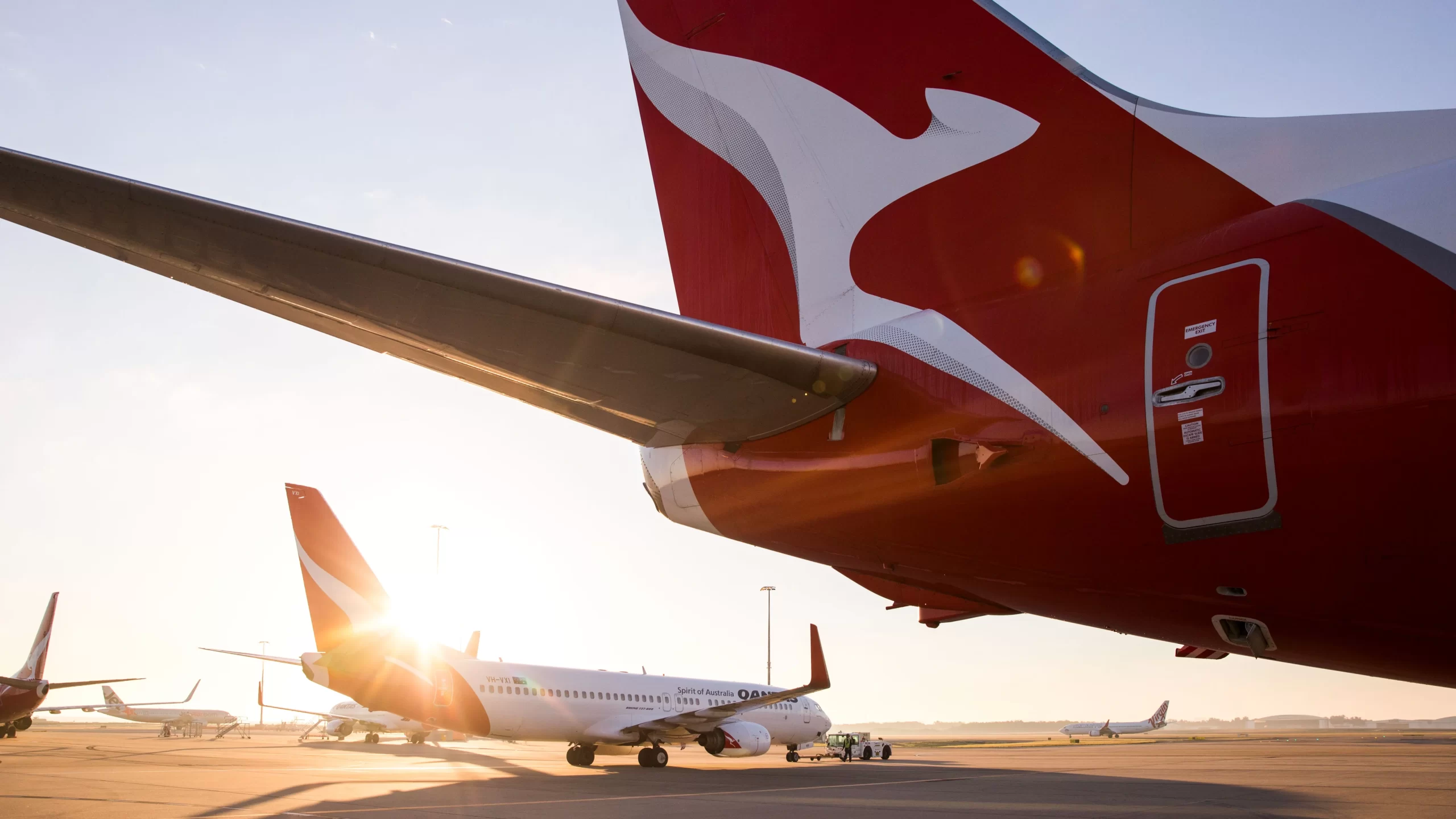
The current and fifth iteration of the Qantas livery arrived in October 2016, unveiled alongside the cabin configuration of the incoming Boeing 787-9 Dreamliner. The redesign was overseen by industrial designer Marc Newson — who had also designed Qantas’ lounges, A380 cabin interiors, and the iconic Skybed — working in partnership with Australian design agency Houston Group. Newson described the brief as retaining the fundamental essence of the flying kangaroo while moving the brand forward into a new generation.
The most significant visible alteration was the addition of silver shadowing behind the kangaroo on the tail, giving the logo a greater sense of movement and depth. A sliver of silver also extended from the tail to the rear of the fuselage, adding what Newson described as a “more premium feel”.
The deep red of the 1960s and 1980s returned, replacing the softer hue of the 2007 livery, and the Qantas wordmark — measuring almost two metres high on the 787 — was given a streamlined, lighter typeface. Qantas also added its name to the belly of the aircraft for improved visibility from the ground and placed a miniature kangaroo logo on the inside edge of the wingtips.
The Retro Roo Liveries: Celebrating Heritage on the Boeing 737
Alongside its standard fleet colours, Qantas has commissioned a small number of aircraft to wear historically accurate reconstructions of past liveries. Known colloquially as the Retro Roos, these aircraft function as flying museum pieces and generate substantial social media attention wherever they appear.
Retro Roo I was unveiled in November 2014, wearing the livery of 1971 to 1984 — the Flying Kangaroo era — on a Boeing 737-800. The aircraft appeared regularly on domestic routes and drew attention for its ochre cheat line and bold tail design.
Retro Roo II followed in November 2015 as part of Qantas’ 95th anniversary celebrations, wearing the Red Stripe livery of 1959 to 1961 — the same scheme applied to Qantas’ inaugural Boeing 707 jets. Former CEO Alan Joyce described the vintage liveries as “flying tributes to the airline’s history of innovation.”
The Centenary Livery in Wore All of Qantas’ History
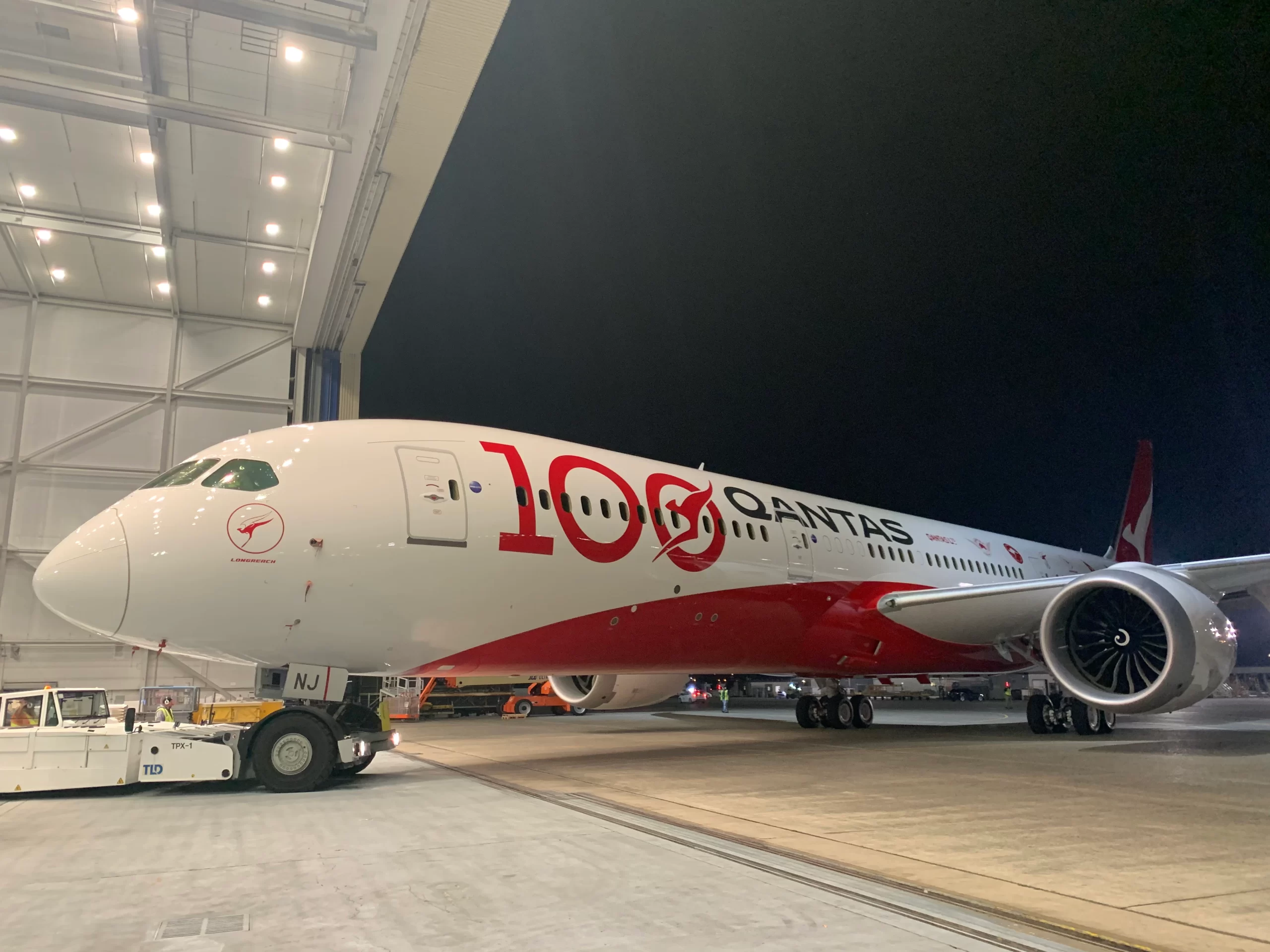
For its 100th anniversary in 2020, Qantas commissioned a special livery for its tenth Boeing 787-9 Dreamliner that served as a visual retrospective of the airline’s entire branding history. The aircraft, registered VH-ZNJ and named Longreach emerged from Boeing’s paint facility in Seattle in October 2019. The fuselage displayed every Qantas logo used since 1920, from the original black typeface to the current silver-shadowed kangaroo, arranged chronologically along the aircraft’s length.
The design also incorporated a “Qantas 100” marque on the fuselage and featured a dynamic red curve extending beneath the aircraft’s belly, inspired by the airline’s contemporary branding. It became the most historically dense livery Qantas had ever applied to a single aircraft, and its role as the vehicle for the second Project Sunrise research flight — operating nonstop from London to Sydney, replicating the journey of the first 747-400 delivery 30 years earlier — made it symbolically significant beyond its paintwork.