Himalaya Airlines (H9) is a Nepal-China joint venture airline that was established in August 2014 and began scheduled flights on May 31, 2016, with a single Airbus A320 flying between Kathmandu and Doha. The carrier is the first to offer services between Nepal’s capital city and Shenzhen. Unlike Nepal Airlines, the country’s much older flag carrier, Himalaya Airlines has only ever changed its livery once, moving from an all-blue tail design to its current orange and blue scheme in 2019.
That single rebrand still tells a clear story about how a young private airline positions itself. The change came just as Himalaya Airlines was expanding into China and the Middle East, and it replaced a minimalist blue tail with a more detailed logo built around Nepal’s national symbols.
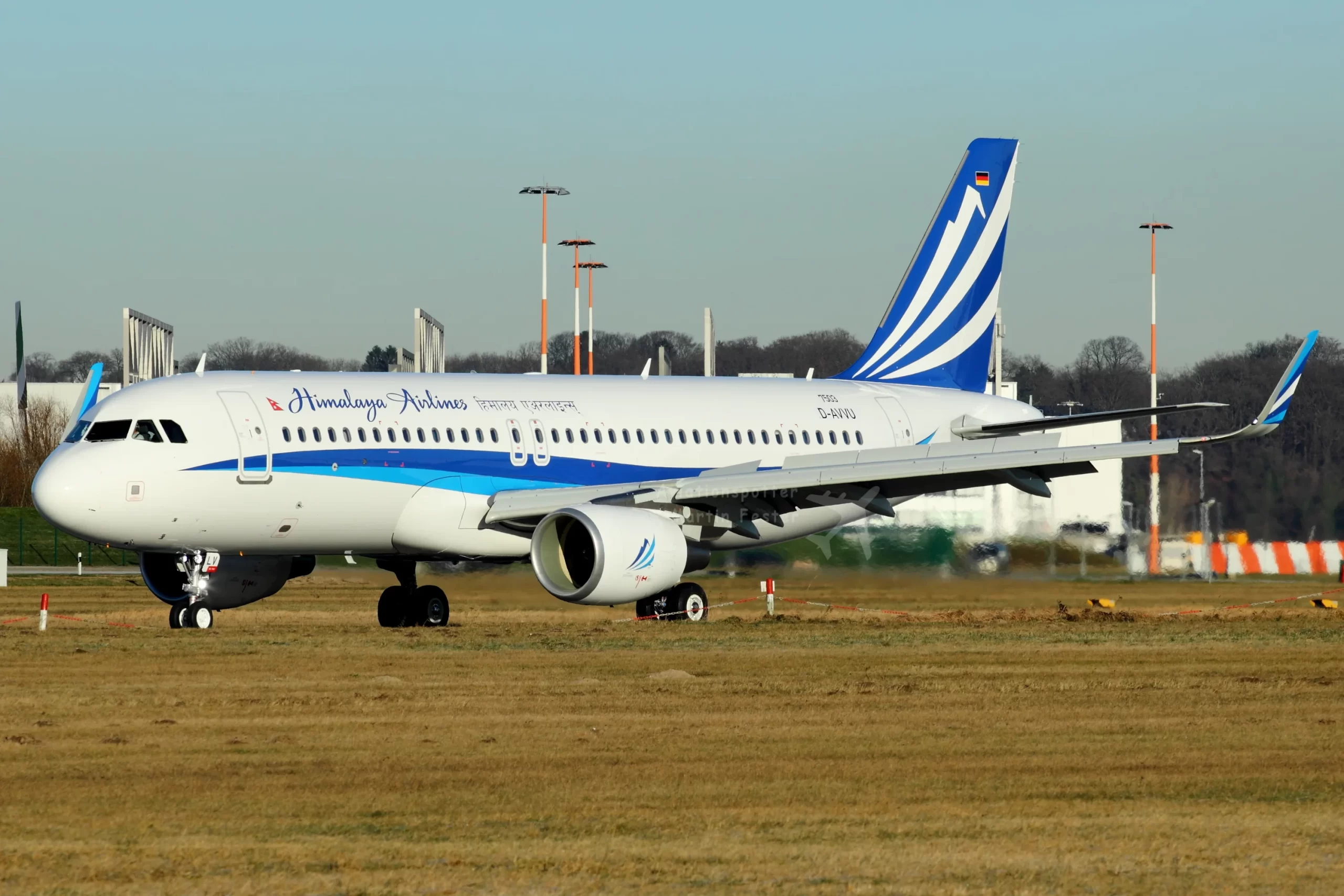
The Original 2016 Livery Used a Solid Blue Tail with a White Wave
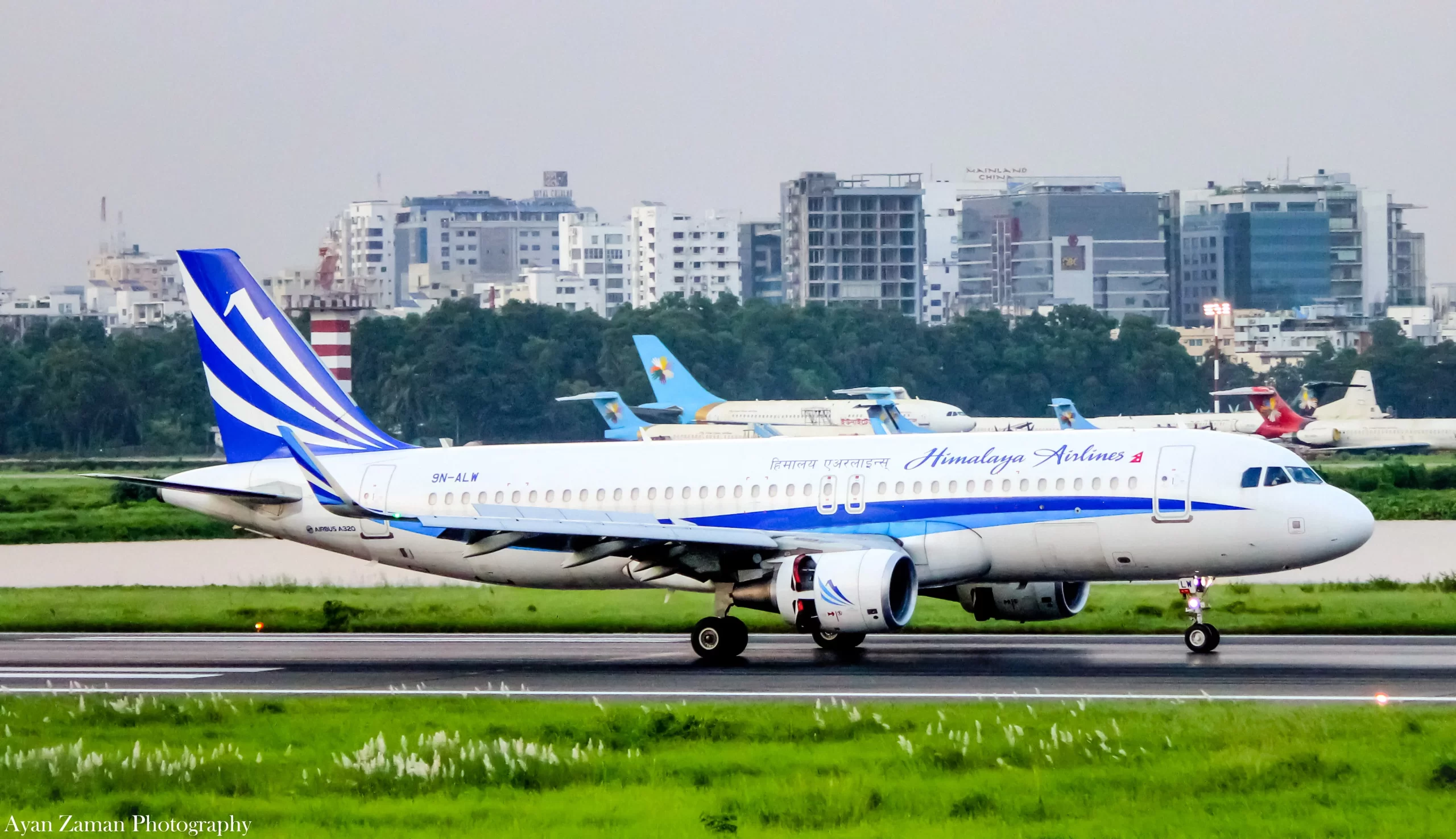
Himalaya Airlines’ first aircraft, delivered from Airbus in early 2016, carried a simple design built around a deep blue tail fin. A white, wing-like swoosh swept diagonally across the fin, paired with a thin blue cheatline that ran the length of the fuselage in two shades of blue.
The airline’s name appeared twice near the front doors in this early scheme, in cursive English script on one side and in Devanagari script reading “हिमालय एअरलाइन्स” on the other. The fuselage stayed almost entirely white, with the blue cheatline providing the only real color beyond the tail.
This livery carried Himalaya Airlines through its launch years, including its first flights to Doha in 2016 and later to Colombo, Kuala Lumpur and Dubai. Photos from that period, including one of aircraft 9N-ALV taxiing after arriving from Germany, show the scheme largely unchanged across the airline’s early Airbus A320 deliveries.
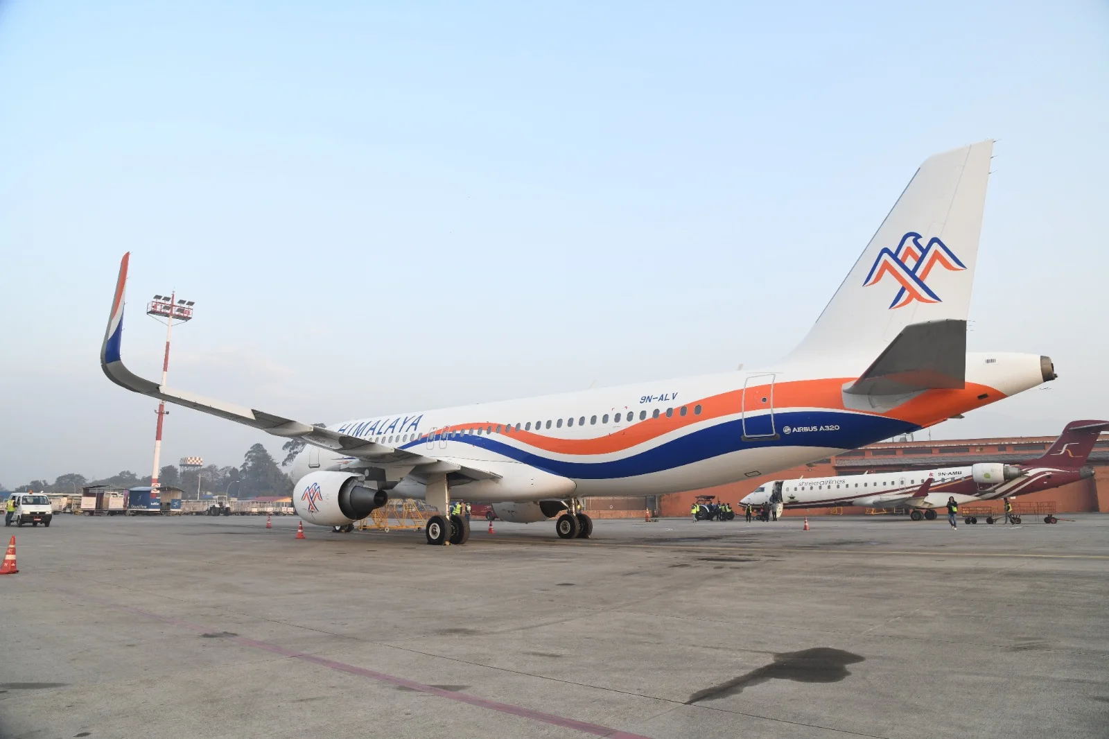
Himalaya Airlines Unveiled Its Orange and Blue Rebrand on September 29, 2019
Himalaya Airlines launched its current livery at a press event at Hotel Royal Singi in Kathmandu on September 29, 2019. President Zhou Enyong and Vice President Vijay Shrestha unveiled the new corporate logo together, three years after the airline’s first commercial flight.
Shrestha explained the thinking behind the change in his welcome speech. “Over the past five years, we’ve built a reputation for safety and reliability. The idea of the brand refresh emerged through some significant changes within the company, leading to evolve our existing logo giving us a new face,” he said.
The rebrand came two months after Himalaya Airlines launched flights between Kathmandu and Dhaka on July 22, 2019, and the airline was flying three A320 aircraft to five destinations at the time. Zhou said the airline planned to add Lhasa and Beijing to its network soon after the new identity launched.
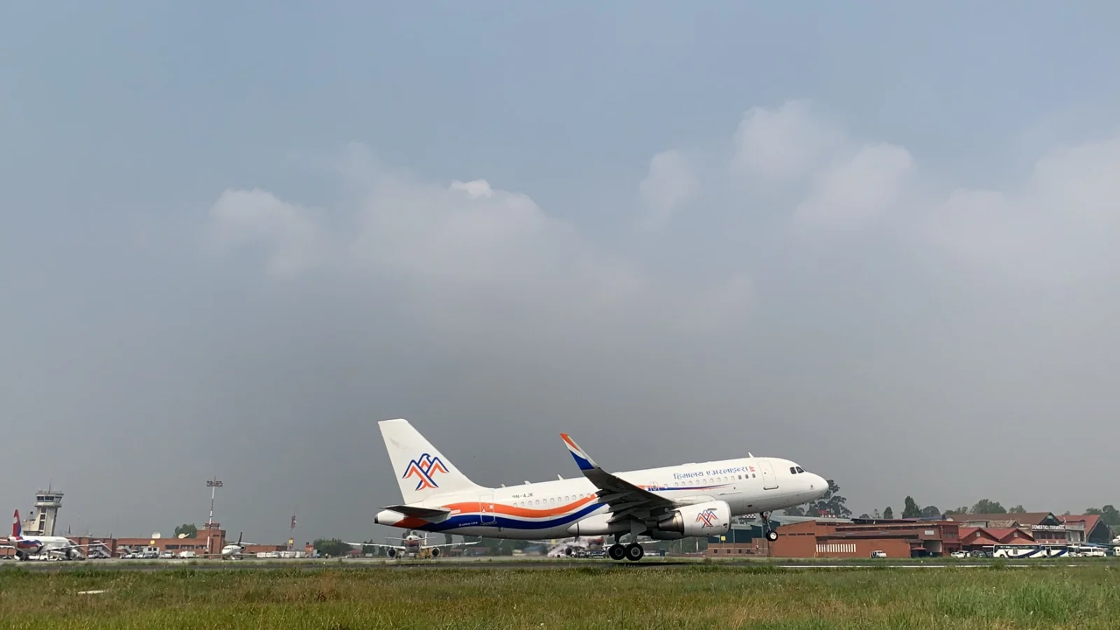
The New Logo Depicts a Soaring Eagle Made from Three Letter A’s
The current Himalaya Airlines logo is built from three interlocking “A” shapes taken from the word “Himalaya,” arranged to resemble a soaring eagle set against a mountain range. According to the airline’s own explanation of the design, each element carries a specific meaning:
- The eagle references a bird that lives in the Himalayan ranges and is seen as a symbol of perseverance and courage.
- The peaks beneath the eagle represent the Himalayan mountains that give the airline its name.
- Blue stands for the sky and signals trust and elegance.
- White stands for snow-capped mountains and signals peace and integrity.
- Orange stands for the people and signals productivity and progress.
Himalaya Airlines described the three colors together as expressing “harmonious unity,” tying the logo’s palette directly to the airline’s stated corporate values.
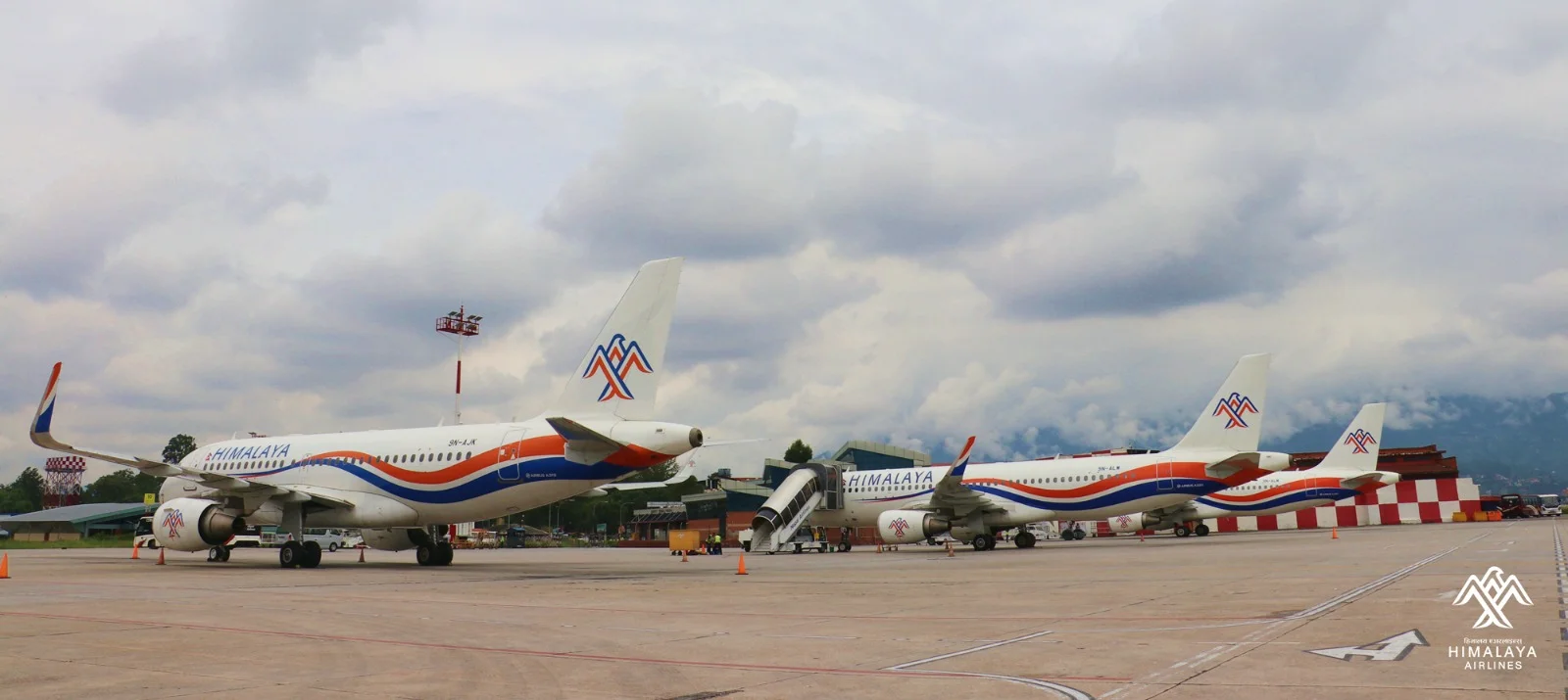
How The New Livery Changed the Aircraft’s Appearance
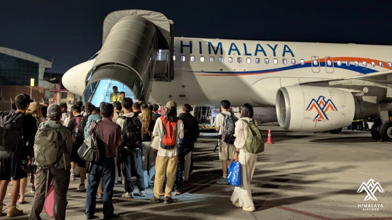
The 2019 rebrand reshaped far more of the aircraft than just the tail logo. Where the old scheme kept most of the fuselage white with a thin cheatline, the new livery wraps a broad, flowing band of orange and blue around the lower fuselage, curving up toward the nose and tapering near the tail.
The tail fin itself now carries the eagle-and-mountain logo, while a smaller version of the same mark appears on the engine nacelles. The airline’s name moved to a bolder position along the upper fuselage, still rendered in both English and Devanagari script, with a small Nepali flag placed beside the English wordmark.
The new design also scales consistently across the airline’s fleet. Photos of Himalaya Airlines’ A320s and its A319 lined up together at Tribhuvan International Airport in Kathmandu show the same wave pattern and tail logo repeated across every aircraft, giving the fleet a unified look that the original livery did not have.
Fleet Growth Has Carried the New Livery Since 2019
Every Himalaya Airlines aircraft delivered since the 2019 rebrand has worn the orange and blue scheme, and the airline has repainted its older jets to match. The carrier’s fleet has grown from three A320s at the time of the rebrand to include additional A320s and an A319, all finished in the current design.
The livery has also followed the airline onto a wider network. Himalaya Airlines now flies to destinations across the Middle East, South Asia and China, including Abu Dhabi, Doha, Dammam, Dhaka, Kuala Lumpur, Beijing and Chongqing, carrying the orange and blue scheme to a route map that reaches well beyond Nepal.
All in All
Himalaya Airlines’ livery history is far shorter than that of Nepal Airlines, which has repainted its aircraft multiple times since 1958. For Himalaya Airlines, the change marked a broader turning point for the airline beyond its paint scheme. It arrived alongside network expansion into China, positioning the new visual identity as part of Himalaya Airlines’ push to grow from a small regional startup into a more established international carrier.

.jpg)
