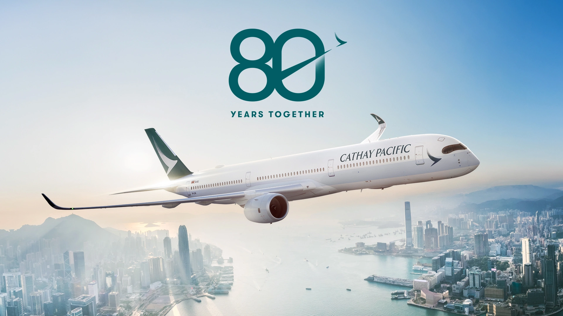
Cathay Pacific Airways (CX), the carrier which announced that it was looking for diversification following geopolitical tensions around the world, has officially unveiled a special retro livery to commemorate its 80th anniversary, bringing back the iconic “lettuce leaf sandwich” design that once defined its presence in global skies.
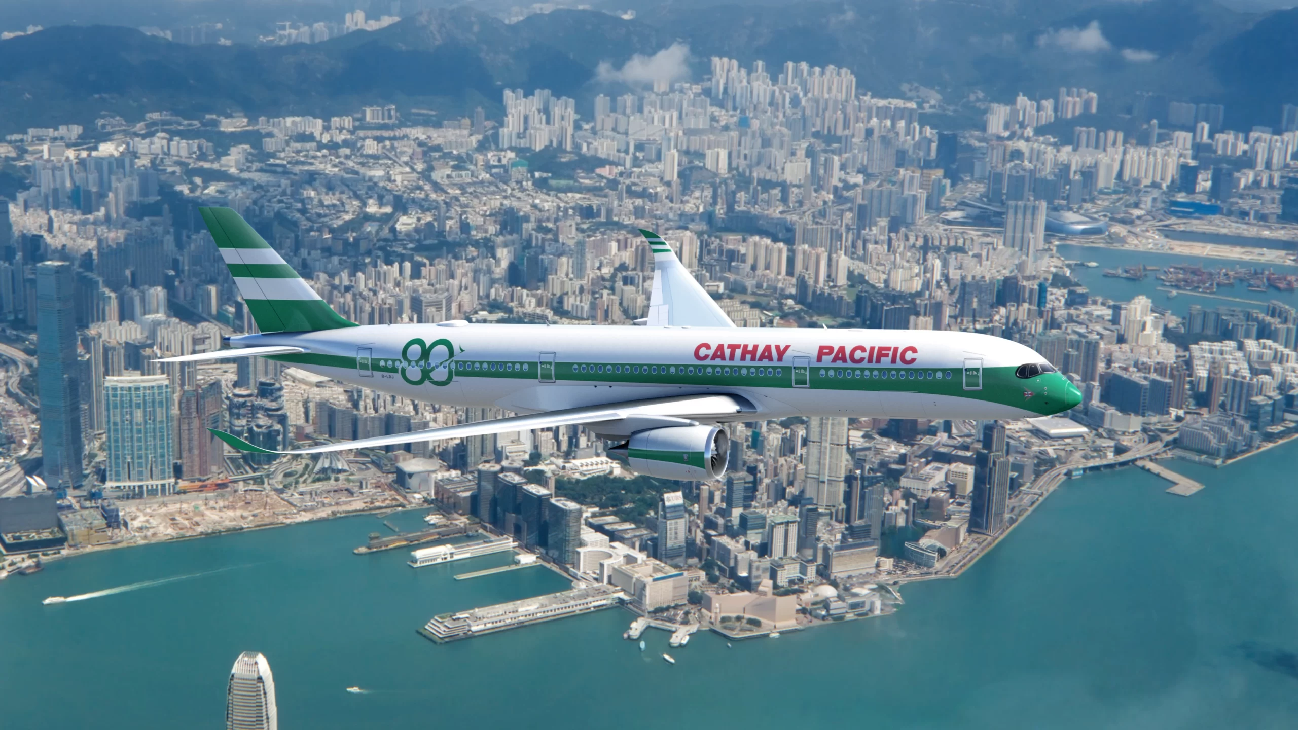
The carrier revealed the heritage-inspired livery at Hong Kong International Airport (HKG) on 6 January 2026, marking a significant celebration of its legacy and evolution since its founding in 1946. The Airbus A350-900 adorned with the retro scheme immediately entered scheduled passenger service, flying from Hong Kong to San Francisco as flight CX870.
Cathay Pacific Airways (CX)
| Attribute | Details |
|---|---|
| Airline name | Cathay Pacific Airways Limited |
| IATA/ICAO | CX / CPA |
| Founded | 24 September 1946 |
| Headquarters | Cathay City, Hong Kong International Airport, Hong Kong |
| Main hub | Hong Kong International Airport (HKG) |
| Fleet size | 179 aircraft |
| Destinations | 83+ destinations worldwide |
| Alliance | Oneworld |
| Frequent Flyer | Asia Miles / Marco Polo Club |
| Average Fleet Age | 12.1 year |
Cathay Pacific Flight CX918 Involved in Taxiway Error at Manila Airport
What is the “Lettuce Leaf Sandwich” Livery in Cathay Pacific History
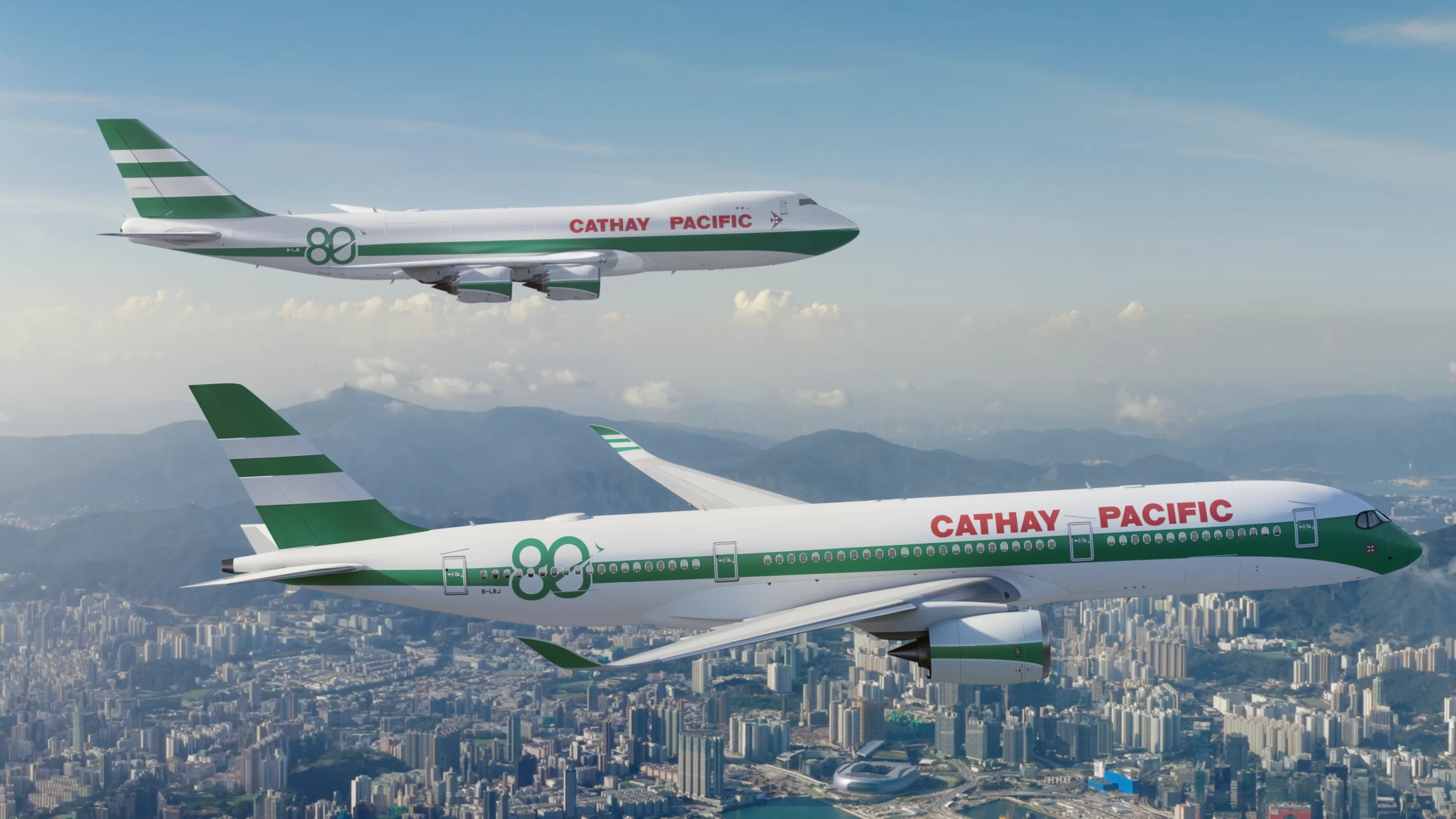
The “lettuce leaf sandwich” livery refers to a classic green-and-white paint scheme employed by Cathay Pacific in its earlier decades. From 1971 until the mid-1990s, this Brunswick green stripe motif was featured across various aircraft including Lockheed L-1011 TriStars and Boeing 747 jets.
-
The design featured alternating bands of Brunswick green and white akin to layers in a sandwich.
-
The airline’s name appeared in red capital block lettering above the windows, a signature aesthetic of its era.
-
A small Swire Group logo replaced the former Union Flag on the tail in the new commemorative version.
According to Norebbo, the lettuce leaf sandwich livery had a vertical stabilizer that is is
” solid green with two white stripes cutting through it horizontally. These stripes are varied in thickness (the top is thinner than the bottom). The Union Jack flag was applied to the top of the vertical stabilizer during the time when Hong Kong was a British Dependent Territory. A single green stripe ran down the entire length of the fuselage. Unlike other airline livery designs at the time, this stripe varied in thickness. It was thicker (and curved downwards) at the nose, and it tapered to a point at the tail cone.”
Some of the other design elements included:
| Design element | Description |
|---|---|
| Upper fuselage finish | Solid white paint applied above the main stripe |
| Lower fuselage finish | Unpainted bare metal beneath the stripe |
| Separator detail | Thin white pinstripe separating the green stripe from the bare metal |
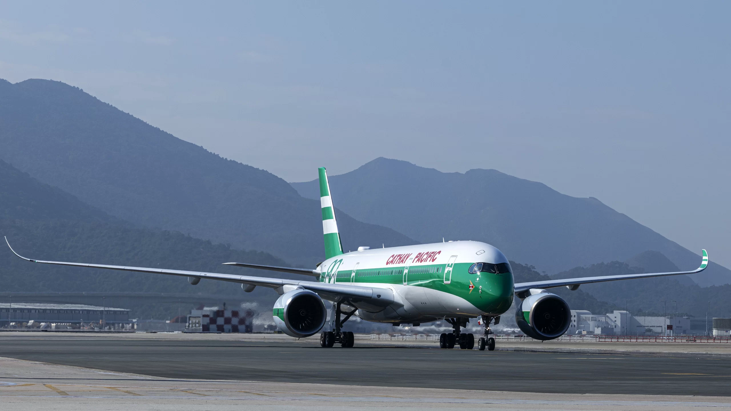
The revival of this livery on the Airbus A350-900 (registration B-LRJ) serves both as a nostalgic homage and a celebration of Cathay’s evolution from its post-war beginnings to its modern fleet.
The “lettuce leaf sandwich” livery evokes the classic green and white color palette that adorned Cathay aircraft from the 1970s to the early 1990s, a period often celebrated as the airline’s ascendant era of international prominence. Alongside the aircraft, staff will also don vintage uniforms representing different design eras throughout 2026, immersing travelers in a living narrative of Cathay’s service heritage.
Aircraft Details: A350-900 Retro Aircraft
According to data from planespotters.net, Cathay Pacific has Airbus A350-900 that are 7.9 years old. The A350-900 is the aircraft type that is deplpyed in some of the longest non-stop flights in the world. The same aircraft type is also deployed in some of the longest one-stop flights too.
In Pictures: The World’s 10 Longest One-Stop Flights in 2025
Let us look at the details of Cathay’s A350-900
| Specification | Details |
|---|---|
| Aircraft Type | Airbus A350-900 |
| Registration | B-LRJ |
| Delivery | Ferried TLS–HKG 10 Dec 2016 |
| Entered Service | 1 Jan 2017 |
| Configuration | C38W28Y214 |
| Commemorative Mark | “80 Years Together” |
The following table gives us an idea of how Cathay has configured its A350-900 with the “80 Years Together” livery:
| Feature | Business | Premium Economy | Economy |
|---|---|---|---|
| Seat model | Safran Cirrus III | Collins Aerospace MiQ | Collins Aerospace Pinnacle |
| Number of seats | 38 | 28 | 214 |
| Layout | Reverse-herringbone | 2-4-2 | 3-3-3 |
| Bed / recline | 75″ fully flat bed | 9″ recline | 6″ recline |
| Seat width | 20.2″ | 18.5″ | 18″ |
| Row pitch | — | 40″ | 32″ |
| Headrest | — | Six-way adjustable | Six-way adjustable |
| Storage / holders | Side under-seat compartment for small items | Folding tablet holder / smartphone ledge | Folding tablet holder / smartphone ledge |
| Display | 18″ HD touchscreen | 12.1″ HD touchscreen | 11.1″ HD touchscreen |
| Power options | Universal AC & USB-A | Universal AC & USB-A | Universal AC & USB-A |
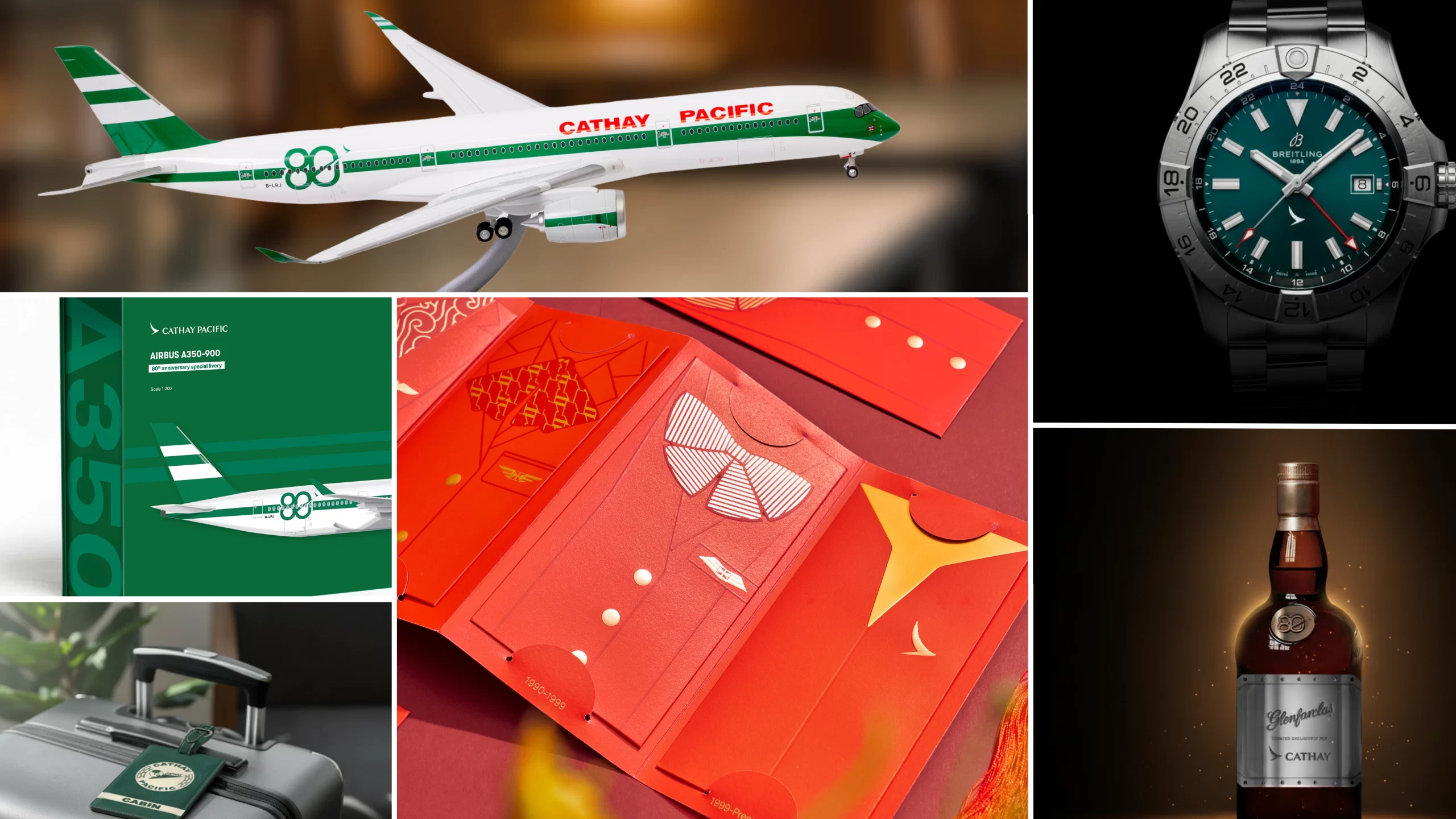
Highlights of the ‘80 Years Together’ anniversary Celebrations
-
Two aircraft to wear heritage liveries: A350-900 passenger jet and a Boeing 747-8 freighter.
-
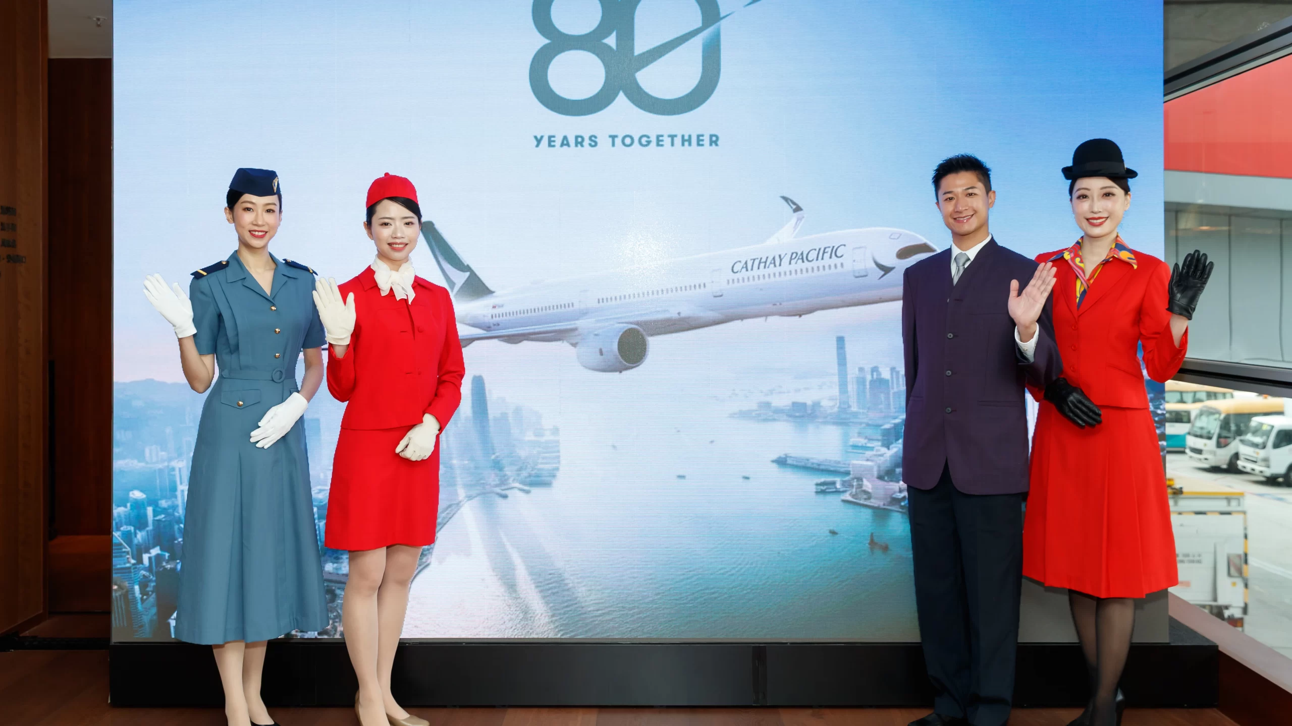
Vintage uniforms: Cabin and ground staff will wear classic attire representing multiple eras, adding experiential depth, with the carrier reporting that “around 1,000 to 2,000 of Cathay’s cabin crew and ground employees will wear and showcase these vintage uniforms at work, bringing the evolution of the Cathay brand to life in true Cathay fashion.“
-
Merchandise collection: Limited edition models, accessories, and commemorative lifestyle items.
-
Future unveilings: Additional special liveries are anticipated through 2026.
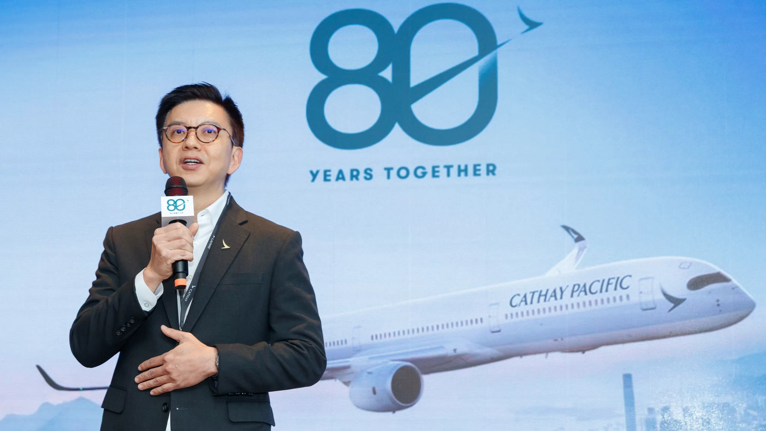
Cathay Group CEO Ronald Lam noted at the launch event that this anniversary is not simply a retrospective but a “shared journeys and memories” celebrating how the airline and Hong Kong have grown together over decades:
“Looking ahead, through our investment of well over HK$100 billion into our fleet, cabin products, lounges and digital innovation, Cathay will continue to elevate the customer experience as we strive towards our refreshed vision to become our customers’ most loved service brand. At the same time, we remain steadfast in our commitment to strengthening Hong Kong’s status as a leading international aviation hub. With the continued support and encouragement of our people, customers and partners, I am confident that Cathay, as an iconic Hong Kong brand, will soar to even greater heights in the years to come.”
Hong Kong–Changsha Route Takes Off: Cathay Pacific Adds Daily Non-stop Service
Cathay Pacific’s Livery: A Brief History
An aircraft’s livery is often predominantly white. There are several reasons behind this. One of the most obvious being the fact that a white-painted aircraft is cool. In addition, a white aircraft is also easily identifiable and painting an aircraft white saves money. For details into the matter, you can read our guide.
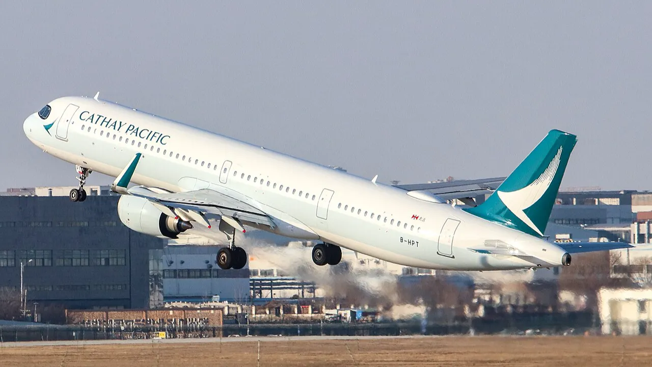
Cathay Pacific’s current livery is also predominantly white. The current livery is an updated version of the “Brushwing Livery” that has been a part of the carrier since 1994, i.e., effectively after the “lettuce leaf sandwich” livery.
_taking-off_from_CGO_02.jpg)
| Comparison criteria | Brushwing livery (1994–2015) | Brushwing livery 2.0 (2015–present) |
|---|---|---|
| Design origin | Created by Landor Associates and introduced in November 1994 as a defining brand identity | Developed with Eight Partnership as a brand refinement rather than a full redesign |
| Tail logo concept | Abstract brush-textured wing symbolising upward motion and flight | Same Brushwing motif, enlarged and rendered in solid white for greater visibility |
| Overall design philosophy | Elegant, restrained, and highly aircraft-specific in visual balance | More assertive and consistent across different aircraft types |
| Fuselage stripe | Light blue stripe running longitudinally with uniform thickness | Retained the same light blue stripe as a core design element |
| Stripe placement | Covered doors and windows on the Boeing 747; positioned below windows on other types | Maintained below-window placement, with visual balance improved through typography |
| Aircraft suitability | Widely regarded as most harmonious on the Boeing 747, less balanced on smaller widebodies | Designed to appear proportionate across the 777 and A350 families |
| Airline titles | Mixed-size uppercase lettering placed within the blue stripe | Fixed-case lettering, enlarged and repositioned above the stripe |
| Nose section treatment | Dark green block at the nose featuring the Brushwing logo | Nose block removed; replaced by a larger standalone dark green Brushwing logo |
| Vertical stabilizer | Dark green tail with smaller Brushwing logo and red accent striping | Solid green tail with a significantly enlarged white Brushwing emblem |
| Accent colours | Incorporated red detailing for contrast at the tail and nose | All red accents removed for a cleaner, more contemporary aesthetic |
| Visual balance | Relied on small colour blocks and accent stripes to achieve symmetry | Achieved balance through scale, typography, and simplified colour blocking |
| Brand evolution intent | Established Cathay Pacific’s modern global image in the jet age | Modernised the identity for clarity, scalability, and digital visibility |
Cathay Pacific’s unveiling of the retro “lettuce leaf sandwich” livery does more than celebrate eight decades of flight; it symbolically connects the carrier’s storied past with its modern ambitions.